The Best (Unexpected) Color Combo Trends Of 2019
Just when I thought that I had figured out what makes a color palette timeless, Laurren, today’s contributing writer, proposes this: Perhaps the new “color trend” is actually unexpected and more about clashing or pairing together unexpected hues. I suppose like many things, creating tension can be what makes them exciting. Typically for room longevity, I’m a classic “opposite sides of the color wheel” fan, but when someone proposes new, dramatic color combos that I don’t have the guts to actually implement (permanently) I say “go for it”, like literally, YOU go for it, because I’m too scared.
BUT, it is fun to think about throwing blue caution to the wind and going for a peach-on-peach (wait, do we all know that peach is HUGE right now…it is, as is mustard) vibe. Anyway, Laurren dug deep and is going to walk you through 10 combos that, like I said, might be scary to anyone used to neutrals and safer palettes, but SUPER exciting to anyone ready for a little something new. Who knows, maybe by the end of this post, I’ll be convinced to paint something orange (ha!). Laurren, take it away.
Thanks, Emily. Hi everyone, I’m Laurren. Long time reader and freelance magazine writer and stylist. (Fun fact: I actually interviewed Emily for a story when I was an editor at Country Living which I haven’t even mentioned to her until now!)
We’re here to talk color. Let me first say that light, bright and airy will always have a place in design (and our hearts). But, after years and years of largely neutral spaces, it feels like the right time for a reverse palette cleanse of sorts. (Arlyn recently made her own plea for more colored walls in design here, and I offer her my full support!) If you, too, are in the mood to shake things up—whether you embrace color via paint or textiles or both—we hope these ideas will serve to get you moving in that direction. And look, most designers (including Emily) would agree that setting a color palette before embarking on a room design is the first (and best) thing you can do to usher decisions further and end up with a room that feels intentional and pulled together.
That said, it’s not always easy to know what to put together. What colors play well in the sandbox of design life? Some combos are obvious, but for anyone who’s tired of seeing the same three colors used again and again, that’s where this post comes in. After doing some initial research and then working to finalize with the EHD team, I think the 10 combos we’re about to share with you are exciting and fresh.
Let’s just dive right into what I suspect might be the hardest sell for some of you, shall we? Are your eyeballs ready to party?
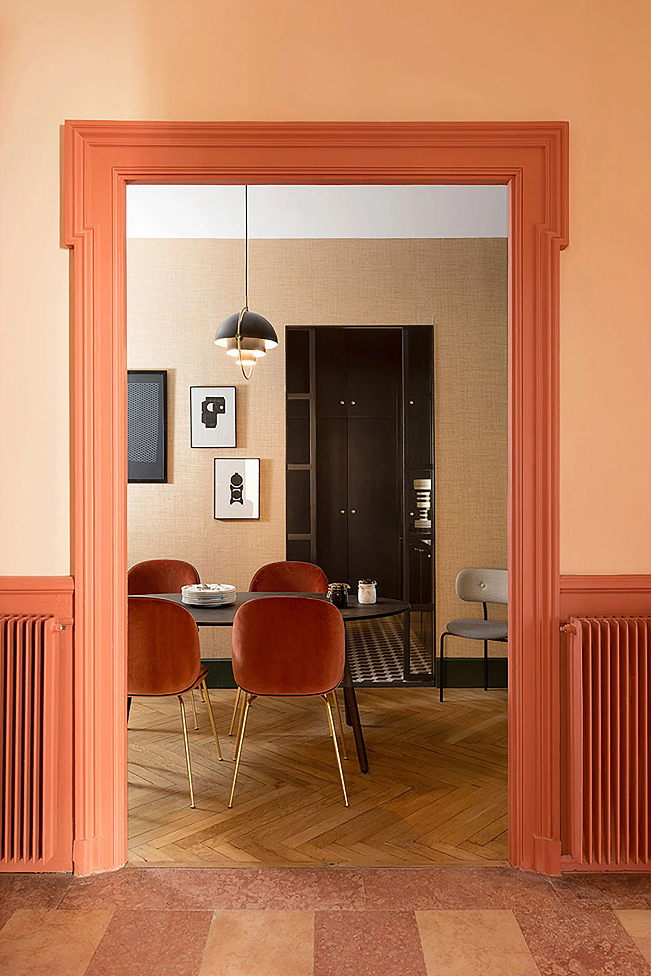
Peach + Coral
I fully acknowledge that the above image is a lot—like a Flintstones Push-Up (remember those? RIP) and an Orange Julius (can you tell I like frozen treats?) melted together into a dining room. I get it. We get it. In fact, the EHD team talked about their reluctance to embrace the coral trend in this post here. (Now I’m wondering if maybe I should have named this post “8 Unexpected Color Palettes We Love Plus One That Maybe Only Laurren Loves?”) but I just can’t stop looking at it. Am I going to go out tomorrow and paint my living room all the shades of orange? Well, no. But in the right space (ideally not a bedroom or bathroom—feels a little energizing for those areas) it can be really, really pretty.
In the above photo via the February 2018 issue of Elle Decoration UK, a heavy helping of black—from the table to the artwork to the light fixture—adds the grounding, sophisticated edge that makes the whole thing just work (well, that and those wood floors). It sort of acts like the little black blazer of the room, taking a color pairing that could lean childlike and fanciful then BOOM—baby’s all grown up! Being able to see into that other room also helps a lot—the dark paint job and patterned flooring gives your eyes a place to regroup, which can be important in such a bold space,
If the first example is just a little too Wild Wild Country for you, or if you’re into something requiring less legwork or commitment, allow your textiles and artwork to do the heavy lifting and skip the paint altogether. Or, use it sparingly, like in the above photo where the orange hue is almost celebrated more than it would be if the whole space were clad in the color.
Terra-Cotta + Cobalt
Peach was large and in charge in the ‘90s, so any Laura Ashley-induced anxiety over its return is 100% understandable. Strip away all the frills and pattern, though, and you’re actually left with a pretty versatile hue that is particularly sophisticated when you bring it down a notch and enter the earthier terra-cotta territory (this is Dead Salmon—lol—from Farrow & Ball). Pair it with black and warm wood accents and a heavy wash of rich blue (specifically that cobalt from the velvet pieces in the living room pictured above), and the controversial shade takes a moody and, dare we say it—lasting—turn.
Blush + Teal + Emerald
While “millennial pink” may be losing steam, it’s not gone for good and goes a long way in softening up the dark blue and green that grounds this kitchen. In a smaller space with lower ceilings, we’d probably recommend layering in some lighter neutrals to add a little airiness, but this particular space can handle all the drama.


